Poetic contemplations
The latest paintings by Anna Kristin Ferking uncover an artist revealing a new side of her production, these thinly layered acrylics are abstract and have a relatively large format. This “new phase” is not unexpected since Ferking has experimented much in recent years, including a variety of media & materials during her studies in Bergen. This short essay will gather together some strands of her work and show that Ferking has developed in a logical and healthy manner; the current abstract paintings show an artist concentrating her skills in a focussed and poetic manner.
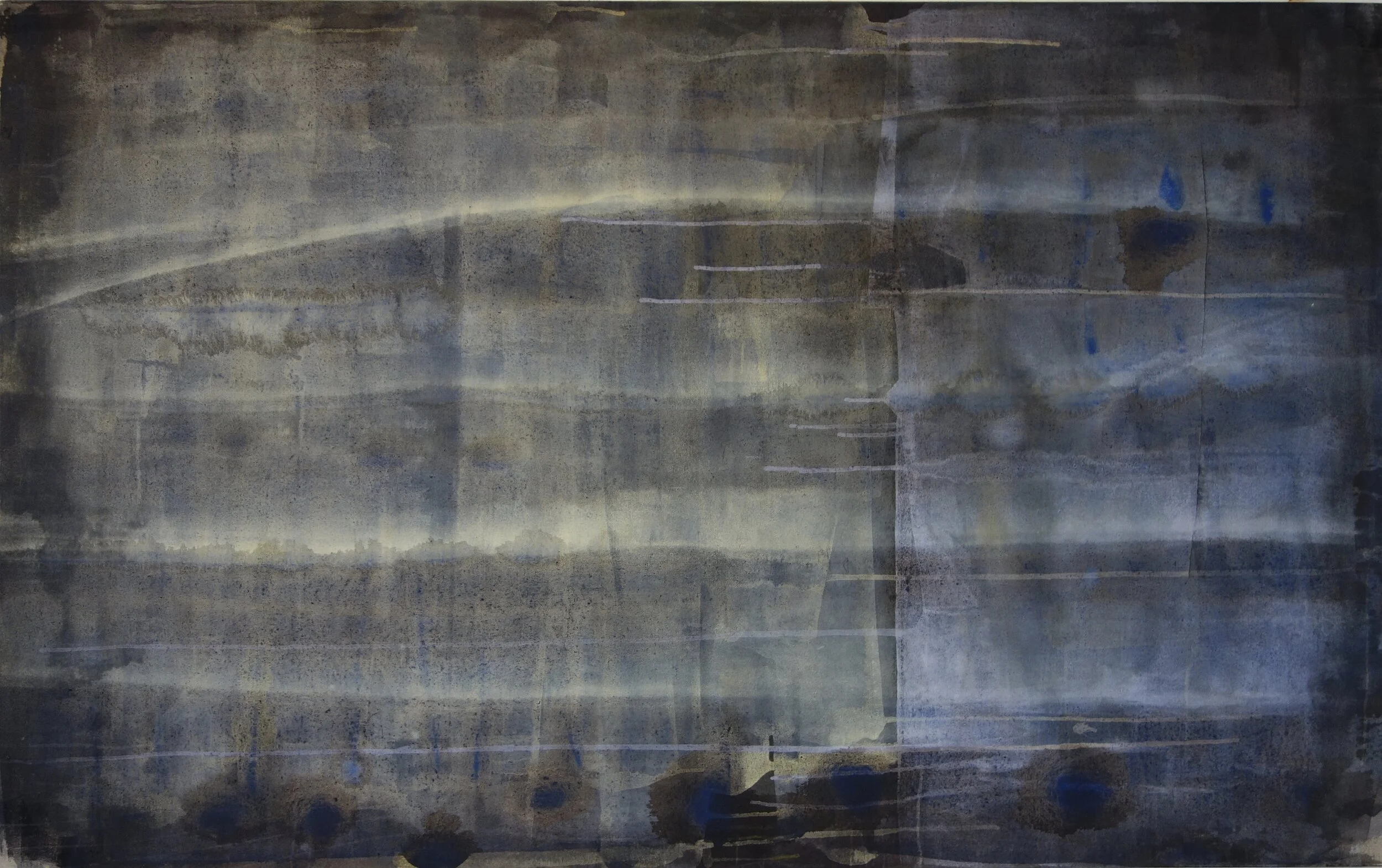
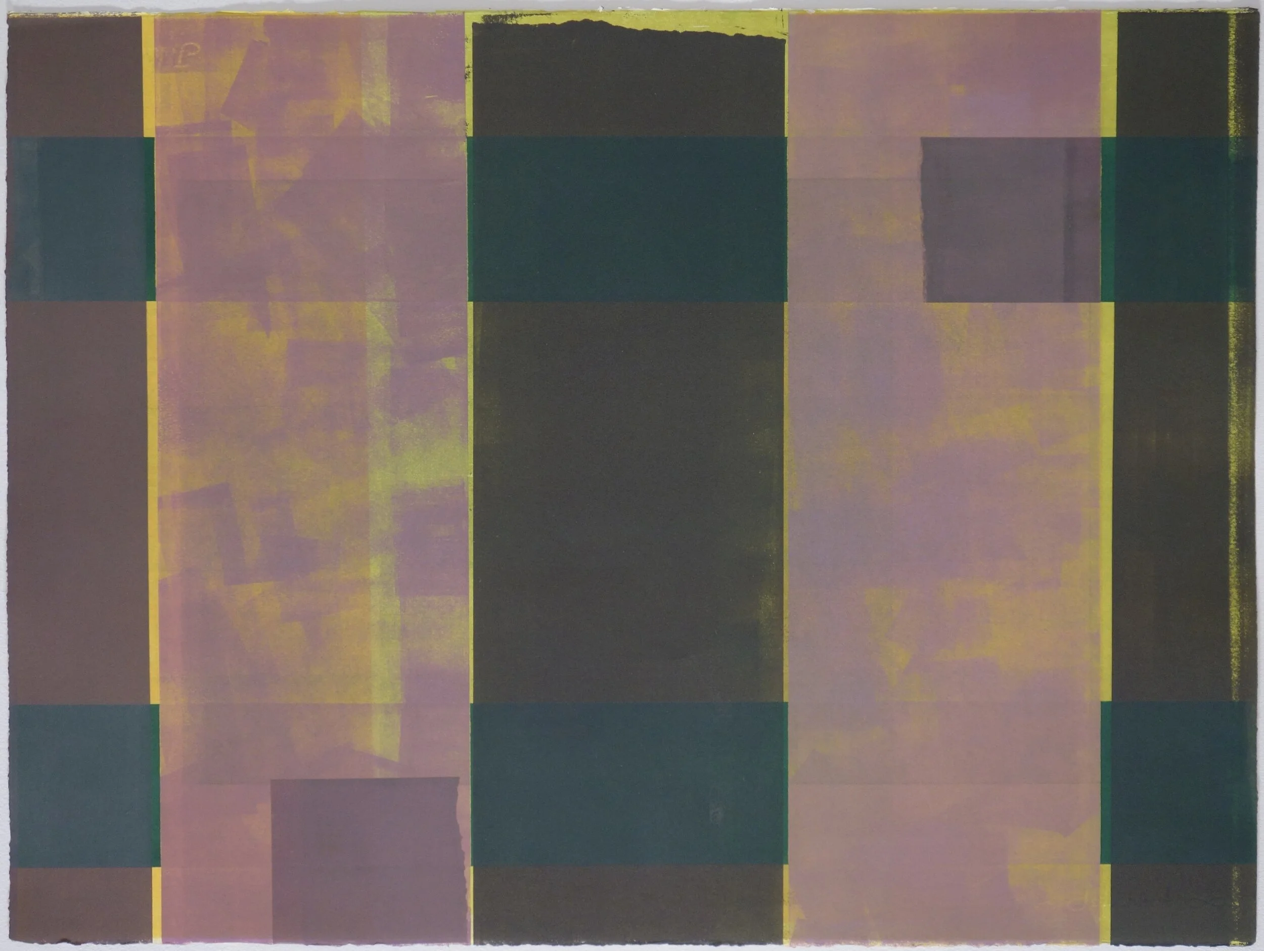
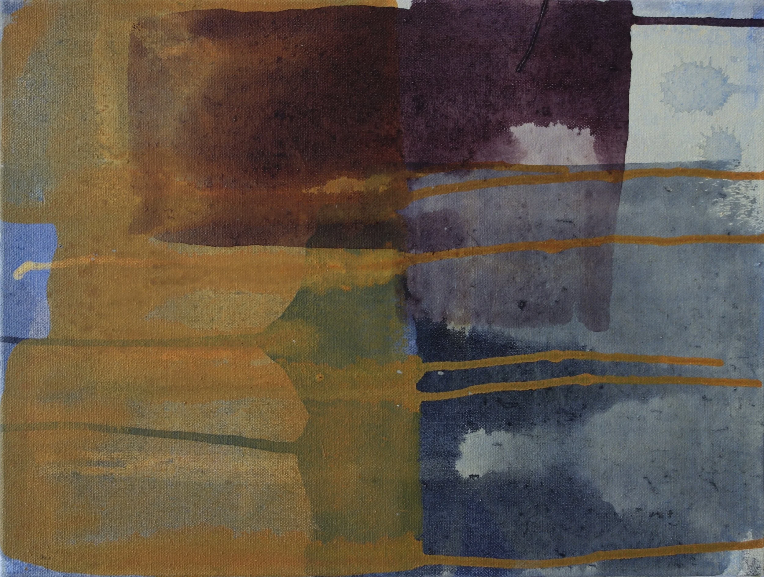
Painting 100 x 120, 2019
The recent paintings have some modest similarities; they are thinly painted and use layers, lines and straight drips to produce a primarily rectangular image. A severely flat picture plane emphasises its own grid parameters. There are few diagonals and a distinct lack of artist’s brushstroke or gesture. Thus, there is no painterliness apart from the emphasised dripping force of gravity. The colour palette is natural and sombre; the blues and yellows of sky and sea combine with earth browns and ash blacks.
Despite the group’s resemblances, it is the individual variation within this collection of paintings that may surprise the viewer. Each work has a distinct identity, the group similarities do not lead to a uniform collection, but rather a collection of distinct personalities. After allowing time to get to know the artist’s new language, the thoughtful and contemplative process that lies behind these paintings should make them very rewarding to the observer. The works are built around a series of contrasts, there is movement in the compositions despite their rectangular backbone, there is much depth despite the thinly layered contents, and interestingly, a balance exists between order and underlying chaos which reveals the artist’s working technique and her opinion about the state of the world today.
A short summary of the background to this new series should allow us easier access to, and appreciation of, Ferking’s paintings.
Background
Anna Kristin Ferking initially learned to be an artist in the graphic workshop, with early years learning and experimenting with the various techniques at workshops in France 1988/89 and Scotland 1999/2008. Ferking is an artist who made a name as a successful printmaker around 2000 with a reputation for brightly coloured rural landscapes of the south west coast of Norway. Ferking’s stylised prints relied upon clean areas of bright colour arranged into naïve compositions, often on the border of figuration and abstraction. Popularity was sudden, due to the refreshing French colour palette and a positive, even humoristic, view of the world.
Ferking was first drawn to the graphic arts due to their materiality, she enjoys the attention to the physical surface and texture that are essential to good printmaking. In addition, in her initial stages, Ferking had the need for a controlled and controllable process. Using a printing press is an ordered procedure; each colour being applied in turn and with disciplined precision. The print workshop is also a
colorist’s paradise. The dynamics of mixing different colours leads to a detailed understanding of colour combinations. In silk print, the painstaking construction of an image through the application of layers of single colours is fundamental. Thus, working in layers of colour has been central to Ferking’s art since the nineties. Printmaking has provided her with a research arena for colour combinations, for abstract and figurative compositions, and not least, the use of the roller as an everyday tool. All of these skills are apparent in the current series of paintings.
Surface and domesticity
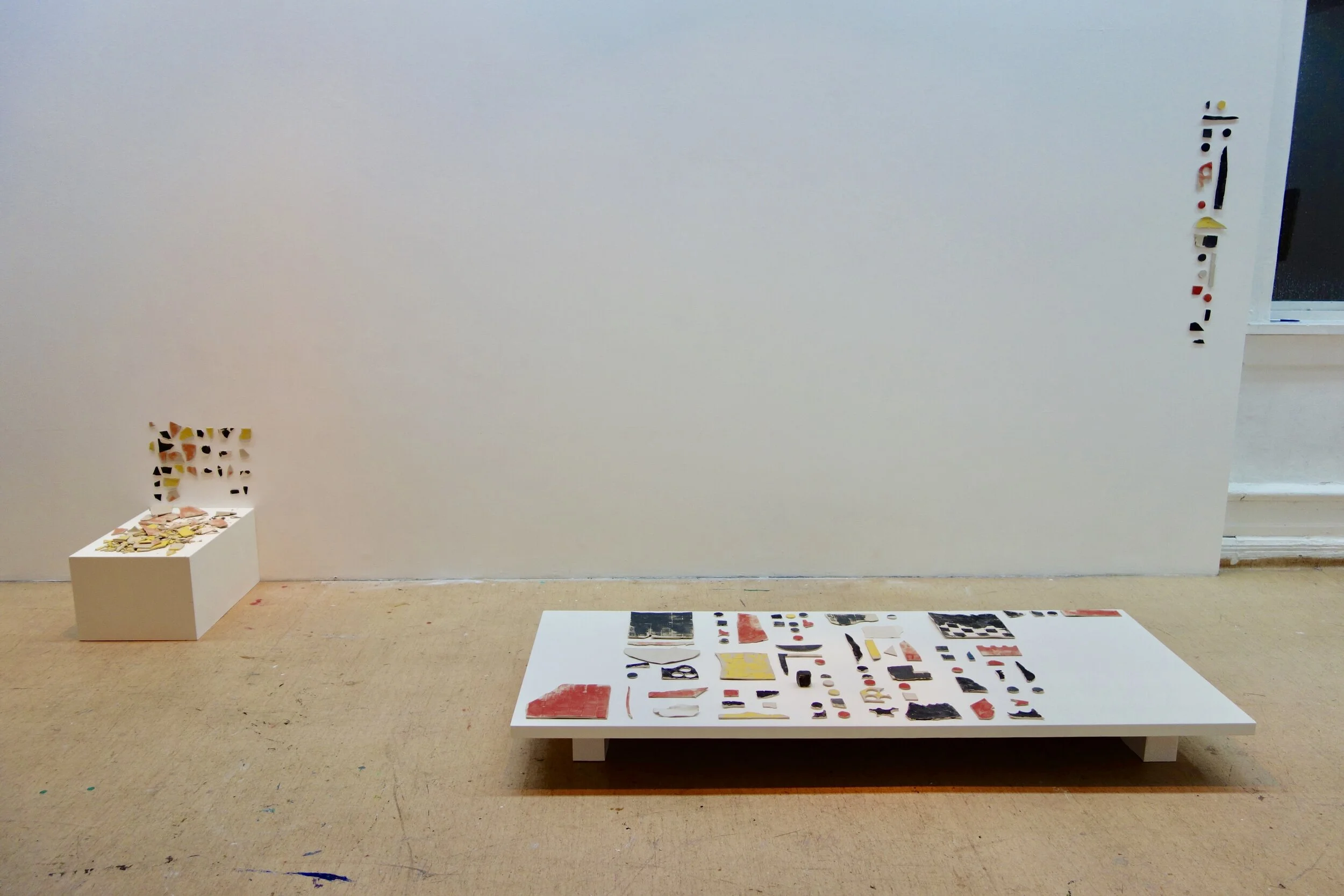
The patterns of domestic life – tablecloths, woven fabrics and textiles – are a focus for Ferking’s interest in physical surface and texture. One can call it the aesthetic of the everyday. Initially this was shown in Matisse influenced domestic interiors in the 1990s. Then, during her time at Bergen Art Academy (2015- 2018), this subject matter matured in an interesting manner. One of the rewards of a concentrated time in education is the freedom gained to pursue untried areas. Although for Ferking certain course elements were not so interesting in themselves, for example textiles and ceramics, the enforced attention led to interesting results that are, in retrospect, much appreciated. For example, at Bergen in 2015 Ferking made pottery sculptures of small houses which she then destroyed. However, the resulting ceramic fragments became of interest, as were some tablecloth material imprints she made in clay. These imprints incorporate the “domestic” into the ceramic surface in a very subtle way, and incidentally, the resulting patterns also resemble the weave of an unprimed (or lightly primed) painter’s canvas.
Ferking intended her use of tablecloths as a comment upon the social pressures for perfection in the home. One can never live up to the (social) media ideal of the perfectly ironed tablecloth or the perfectly decorated interior. Throughout her career, many of Ferking’s artworks have addressed this domestic ideal.
A good example is “Celebration” 2019, recently shown at Haugesund Billedgalleri. A wood and perspex print was made in several layers and is inspired by table cloths in general. But the print is enveloped in a huge see-through plastic envelope. The envelope/bag is marked and lined with seemingly random overspills from the workshop. In total the installation is 130 x 219cm and the physicality of the plastic, the concealing of woodprint with the everyday rubbish that echoes the print’s workshop process, successfully takes the “fine” out of “fine art”.
From monotype to painting – the roller
The working method most closely related to Anna Kristin Ferking’s present series of paintings is the monotype. A monotype is a unique print, the artist paints on a surface such as metal, plastic or glass and then transfers the wet design to paper either by pressing physically or, as in Ferking’s example,
placing in a mechanical press. This is a technique that Ferking has used throughout her career, and, the development of her monotype style reflects overall tendencies regarding colour palette and the evolution from figuration to abstraction. In 2007-2010 a series of figurative works Fotspor (Footprints) depicted localities of the artist’s personal background. These were very popular and are now mostly in private collections.
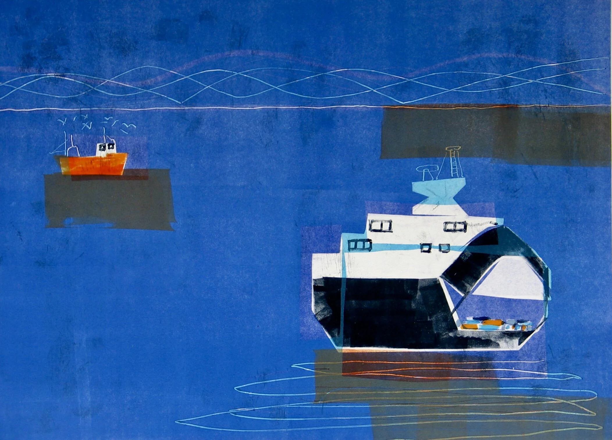
På heimveg (Going home) 2010, monotype
In the early figurative land and seascapes, one sees simple cuts of perspex or metal being used to give repeated anchor-points to a composition. For example, the repeated brown blocks in Båter (2010) that emphasis the pictures two-dimensional flatness within a traditional landscape composition. Subsequently, these individual block elements were liberated from figuration, leading to pure abstract compositions in both silk prints and monotypes. It is here that we see the emergence of a pictorial style closely allied to the current series of paintings.
Thus, we see a logical development within her preferred graphic discipline; Ferking moved away from bright colours and away from figuration. The developing confidence and freedom from three years in Bergen resulted in an important final degree show in 2018. This consisted of monumental sized roller paintings upon decorator’s plaster boards and a large painted floor rug made from the simple protective floor covering used by house painters. The roller is her preferred technique, and the use of this tool is natural when one considers the countless hours using the roller in the graphic workshop.
I paint with a roller instead of a brush. This is a tool that is more mechanical. As the home is my "muse", the place I draw inspiration from, painting with a roller is therefore a link to painting walls in a home.
Some noted twentieth century artists also used the roller, Frank Stella chose to use the house painter’s tools and techniques in order to get away from the personality of the painter’s gesture. In a reaction to Jackson Pollock’s blatant personality, Stella wished the artwork to stand more independent of its maker. By using a roller Ferking eliminates the effect of the expressive brushstroke and gives the surface a frictionless clarity. The layers of wash intertwine poetically and the “careful” addition of drip formations balances order and chance. However, Ferking’s roller is never wholly anonymous, the experienced hand of the artist is apparent.
Conclusion - A poetry of controlled intuition
The painter’s technique
To understand these abstract paintings better it helps to understand the artist’s way of producing the works, the mood she wishes to attain and the degree to which she controls the method.
I often need a specific idea to get started. But further on it is about getting into a meditative state, it’s about presence and what occurs when I do not think. My experience is that intuition is strongly linked to past sensory experiences that are expressed in the creative process. The language of my dissemination is abstract, which is a way of capturing the formless, the invisible, and the things we sense but which are intangible. Anna Kristin Ferking
This description of her working practice is very different from the strict routine of the graphic workshop. A disciplined and measured application of layers, perfectly measured, is replaced with an intuitive modus where planning and thought is replaced by a meditative sensory experience. Ferking’s colorist abilities ensure that her abstract meditations are dominated by sensory colour combinations. Intuition allows chance and, even, the presence of chaos. A balance occurs between control and releasing power. Bystating that she does “not think too much” Ferking allows freedom into the process. Her painting with rollers is an intuitive duality of control and chance. This shows an artist entering into an exciting new phase of her career, the freedom of the painted canvas being in contrast to the more controlled arena of the graphic workshop.
There is one important similarly to Ferking’s print making; she discards or paints over many of her paintings. This is a graphic workshop habit which ensures that only the best work survives. The precision of the printmaking process can make any artist a perfectionist, it can lead to a heightened critical attitude to one’s own productions, and, an ability to destroy or redo works that do not live up to the artist’s own standards. This can be both positive and negative, final works tend to be well nurtured and checked over a long period, so that the quality is high (as with Morris Louis for example). Simultaneously, the artist needs to allow unexpected positive “accidents” to survive her culling process.
Influences
There is a strong tradition in Norway for artists being strong in both printmaking and painting. But many Modernist and Late Modernist painters were often reliant upon signature brushstroke and colour. Anna Kristin Ferking’s paintings have no sense of the signature gesture that was important in C20 Norway, and, to C20 American abstract expressionists such as Jackson Pollock and Willem de Kooning. However, Ferking ́s technique does remind one of some American artists of the 1950s such as Helen Frankenthaler, Frank Stella and Morris Louis. Anna Kristin Ferking brings a Nordic palette and an innate appreciation of nature to this painting tradition.
Ferking states simply;
I might have used up the bright colours earlier, and I can’t do them just to please the public.
Such that there are no bright primary colours and no shining glare. Layer upon layer of natural colours prevail; the colours of the Nordic land and seascapes. Her intuitive method gives an inner drama attached to the choice and combination of colours; Ferking has become a conservative, measured colourist. There are areas of density; compressed layers of colour resembling an archaeological dig. The inlaid, modular, even puzzle-like layers prevent any roaming to a free horizon. Hence a density, a lack of spaces between layers, which adds to the painting’s gravity. As Ferking explains in her method, the sensory world keeps peeping in, especially in the colours, which are richly organic. The tawny ochres and submerged blues evoke landscape, but in a distant way.
A darkening world
The world seems rather absurd and gloomy at the moment Anna Kristin Ferking
No artist can exist outside the framework of his or her own times. But is there a pessimistic and gloomy feel to these pictures? I think not. At present society seems to be emptying itself of vision and faith in the future, we are caught in self-centered claustrophobia and climate disaster. It is no wonder that the palette of even a French trained colorist can darken.
The simplicity of Ferking’s painted surfaces is a refreshing contemplation. She uses paint, almost staining, as a technique to create an embedded, intentional, two dimensionality. Her method is an intuitive response to her senses and her memories. Intuitively allowing areas of the unconscious to directly express itself on the canvass.
Anna Kristin Ferking is an experienced colorist now using a subdued pallet to provide us with contemplative paintings. The balance between a disciplined order and an underlying chaos gives these works freshness, spontaneity, and a great dynamism. These works are poetic and beautiful in colour tones that suit the mood of our times. They show an artist entering a new exciting phase in her career. Indeed, these paintings provide a space for the spectator to take a well-deserved break, a time-out, from a world that does indeed appear rather absurd and gloomy at the moment.
Martin Worts, August 2019
Martin Worts was the leader of Rogaland Kunstsenter, Norway, between 2002-2012 and Haugesund Billedgalleri, Norway, between 1996-2002. He is an art-historien educated at the Warwick University and University of Central England, Birmingham, resided in Norge since 1992. Worts has written many text/catalog about Norwegian artist and various issues in Nordic contemorary art. Since 2012 he has worked with cultural preservation at Hå gamle prestegård, Norway.